How many people visit your eCommerce site on a daily basis?
If you’ve been implementing a basic SEO strategy, there’s a good chance that you’re noticing a spike in traffic. But even with more visitors navigating to your site, you’re not seeing much of an increase in sales.
So what’s the problem?
That’s because website traffic doesn’t automatically translate to dollars.
Don’t get me wrong; obviously website traffic is important. You can’t get visitors to convert if they don’t land on your site in the first place.
But with that said, CRO (conversion rate optimization) needs to become a top priority for your eCommerce shop.
First, you need to understand your metrics and determine your current conversion rate. The average online conversion rate is between 2-4%. But Amazon supersedes that average with a conversion rate of around 15%.
There is a reason why they are so successful, and it’s directly related to statistics and science.
For starters, they pay attention to CRO, which is something that most eCommerce owners aren’t doing.
I consult with lots of business owners. One of the main reasons why they aren’t focusing more on CRO is because they don’t believe that it can be significantly improved.
So instead, they run campaigns to drive more traffic to their website. It’s very hard to double your traffic, but doubling your conversion rate is a lot more straightforward, and it will yield the same amount of increase in terms of your revenue.
For those of you with low conversion rates, you’ve come to the right place. I’ll explain how prioritizing conversion rate optimization for your eCommerce shop can grow your business.
Understanding Conversions
Before we proceed, it’s important for you to understand how conversions work. With some websites, conversions can mean lots of different things.
For example, a small business may be using their website to get local residents to sign up for their email newsletter. In this case, anyone who navigates to their site and subscribes to the email list would be considered a conversion.
But when we’re talking about eCommerce sites, conversions equate to transactions.
Here’s a look at average eCommerce conversion funnel as of June 2018.
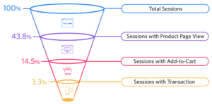
The reason why it’s so important to understand this funnel is because each step ultimately contributes to your final conversion rate.
If you’re able to get more sessions with a product page view, your add-to-cart sessions will increase, which will result in more conversions.
You need to analyze your metrics to see which part of your conversion funnel needs the most improvement.
For example, let’s say 30% of your traffic is adding an item to their shopping cart. That’s more than double the industry average. But if your conversion rate is just 2%, then it’s safe to say there’s a problem with your checkout process, and you need to focus on reducing shopping cart abandonment rates.
As you analyze your funnel, you’ll notice how many different factors can contribute to more conversions. Most people don’t understand and know these deep details.
Conversions are related to multiple factors such as authority, trust, ease of use, finding the right products as well as price points and functionalities you have on your site.
In this guide, we’ll break them down in terms of section, cause, and effect.
Authority / Design
The look and feel of your website are important. This should match your product type and be aimed at your target audience.
For example, if you’re selling a pillow, you’re website shouldn’t have a black background with dark features.
If your target audience is teenage girls, then the color scheme on your site should be pink or purple as opposed to brown and navy blue.
It’s important for your website visitors to feel comfortable on your site and trust it. Otherwise, they won’t get past the first phase of the conversion funnel, which we previously discussed.
All of your contact information should be easy to find. Things like your phone number and address will build authority and show your visitors that you’re legitimate.
When you’re designing your website, you should focus on simplicity.
If you’ve got too much clutter and noise, it’s going to distract people and hurt your conversion rates. Furthermore, simple websites load faster.
Bounce rates increase by 100% when pages take more than four seconds to load.
Improving your load time will lead to fewer bounces.
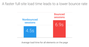
This will ultimately help you get more conversions.
So get rid of any unnecessary clutter on your website. Instead of focusing on quantity, focus on quality elements that add authority to your pages.
Brand
Being a well-known brand will play a huge role in your conversions.
Earlier I explained how Amazon’s conversion rates are roughly 5x higher than the eCommerce industry averages. It’s because they are an authority website.
When someone visits their site, they don’t need to look around to see if they are a legitimate business or not. The name says it all.
Selling high-quality products will also impact your conversion rates.
- Apple
- Nike
- Oakley
- Gucci
These name brands speak for themselves. Again, this is related to quality and authority.
So how do you become one of these household names? This isn’t something that can just happen overnight.
It can take years to build up a respected brand name. But it starts today.
Work with influencers on social media to help you build credibility and establish social proof of concept. Sell quality products and offer first-class customer service. If you combine those factors with a winning marketing strategy, the rest will take care of itself over time.
Product Page
For eCommerce websites, the product page is arguably the most important part of your site.
This is where users see the products that you’re offering and make a decision. But it’s also where I see so many eCommerce sites make mistakes that kill their conversions.
Like I said before, you need to prioritize quality over quantity.
Depending on your business, some of you may be selling hundreds or potentially thousands of products. Don’t try to cram everything on one page.
It’s known as the Paradox of Choice. Giving your customers too many options will lower your conversions. Just take a look at this study conducted in a grocery store.
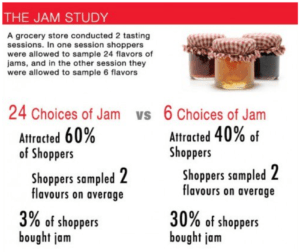
Conversions were 10x higher when customers were presented with six choices instead of 24.
Keep this in mind when you’re designing your product page. Your add to cart buttons should be above the fold. But we’ll talk more about your call-to-action later on.
Each product should have multiple images. These should be professional photos and highlight the top benefits of each item.
When people shop online, they don’t get the same experience that they do in a store. They aren’t able to touch, feel, or try on the products. So they rely heavily on these photos to help them make a decision.
If your photos don’t properly portray your product and give shoppers all of the information that they’re looking for, it will hurt your conversions.
There should only be one page per product, no matter how many options or color choices there are for it. Don’t use duplicate URLs.
The product page should update dynamically, including the prices, when different options are selected. Apple does a great job of accomplishing this, so you can use their site as a reference.
Shopping Cart Page
Just like your homepage, the shopping cart page needs to have trust-building elements.
Remind your customers that you’re a legitimate business and you’re not looking to steal their money and run. OK, so you won’t say that in those words, but there are things you can do to reinforce that notion.
Highlight your quick and easy return policy. Display your phone number and customer service options.
The “checkout” CTA needs to be clear, obvious and displayed above the fold.
But once a visitor adds something to their cart, we don’t necessarily want them to check out just yet. You want them to keep adding more items to their cart before they complete the transaction.
Lots of eCommerce stores miss out on the “soft add-to-cart” option. This is an essential component to increasing your average order value.
Let me show you an example so you can see what I’m talking about. Look at the Champs Sports shopping cart.
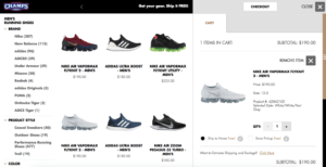
When a visitor adds an item to the cart, they don’t get redirected to another landing page.
Instead, there is a soft popup showing that the item was added and they remain on the product page. This makes it easier for them to add more products to their cart.
Checkout Page
The checkout process should be as seamless as possible.
Each time you add a step to the process you lower your conversion rates. So don’t ask your customers for unnecessary information.
You shouldn’t force people to create a customer profile just to buy something. While these profiles will help you personalize the customer experience in the future, it’s not worth losing a sale over making it a requirement.
According to a 2017 study, 37% of consumers said they abandoned a shopping cart because the site wanted them to create an account.
28% of consumers abandon shopping carts because the process was too long or complicated.
So keep it simple. We’re a big fan of removing all site navigation when a user gets to the checkout page, so their only option is to check out and nothing else. You can refer to Amazon’s process for this.
Calls to Action
I don’t want to sound like a broken record, but I’ll say it again; your add-to-cart and checkout buttons always need to be above the fold. People shouldn’t have to go searching for your CTA.
For the most part, your primary CTA will always be “add to cart,” but you’ll have secondary CTAs as well. I briefly mentioned this concept earlier.
Some examples of a secondary call-to-action would be:
- Subscribe for deals
- Sign up today
- Follow us on Facebook
But your primary CTA should always take priority. Use images to your advantage when you’re coming up with your CTA placement.
I also recommend a light exit intent popup. A gamification tool, such as Wheelio, is one of my favorites.
This software recognizes when a user performs an action, such as opening a new tab, that suggests they’re going to exit your page.
Then a pop-up appears that entices them to stay on the page. By making this pop-up behave like a game that adds value to their shopping experience, it won’t be perceived as annoying.
Functionality
The eCommerce functionality of your site will also impact your conversions.
This relates to how your site is designed and programmed. What steps are you taking to make sure that your visitors spend more money and ultimately convert?
Some of the most import functions of an eCommerce site are:
- Upsells prior to checkout
- Shopping cart abandonment recovery
- Advanced search features
- Warranty
I want to take a moment to go into greater detail about each of these concepts so you have a firm grasp of how they should be applied to your site to optimize conversions.
Pre-Checkout Upsell
Pre-checkout upsells can increase your average order value by up to 40%.
That’s because consumers are primed to buy when they’re viewing their shopping carts. By this point, they’ve already decided that they’re going to purchase something.
Now they are more inclined to buy something else if it’s related to the items in their cart.
For example, let’s say a user added a bathing suit and sunglasses to their shopping cart. A reasonable upsell would be something like sunscreen or sandals.
The best pre-checkout upsells don’t interrupt the process. Adding those additional items would be a simple click and that’s it. Otherwise, they can just continue buying the original items.
Recover Abandoned Carts
Shopping cart abandonment is a real problem for eCommerce stores. This is a metric that you need to keep track of at all times.
Think of it like this. Someone was just a click or two away from completing a transaction, but something stopped them from doing it.
What happens when someone abandons their cart? You need to do something about it.
Sometimes a friendly reminder of those items is all it takes to drive the sale. Take a look at this shopping cart abandonment email from Warby Parker.
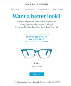
This example is great because it shows the customer exactly what was left in the cart. I think this approach works better than ambiguous messages stating that “something” was left behind.
I also like how Warby Parker used this email as a way to remind the customer about the benefits of buying from them. Free shipping and free returns.
So if you’re not currently sending out cart abandonment emails, you need to start. Take notes from the example above.
Advanced Search and Filter
As I said before, you can’t put all of your products on one page.
So how will your website visitors find what they’re looking for? You need to give them options with an advanced search and filter functionality.
For example, if you sell clothing, you can filter results by gender. Or you can have an option for activity, such as workouts, casual, or formal.
You want to make this navigation as simple as possible for your customers so they can find what they’re looking for as fast as possible.
Add Warranty Functionality
You can implement a functionality that prompts the consumer to add warranty for an additional cost before items get added to their cart.
This is a great opportunity for you to increase your average order value (AOV) by offering warranty. Also, 90% of these warranty products are usually profit.
If you offer a consumer-friendly warranty, customers will be more inclined to make a purchase knowing that you stand behind your product. This will help you increase conversions.
Reviews and Rich Snippets
This is how your products will show up with a star rating next to the results of an organic Google search or paid search campaign.
These elements will help increase your conversions significantly.
You should be using a review tool such as Yotpo to maximize your results. For advanced rich snippets, we can help.
Repeat Orders
Getting repeat orders needs to be an essential part of your eCommerce marketing strategy.
Most people look at their AOV (average order volume) and determine that they can’t run PPC ads or do affiliate marketing because the cost can’t be justified.
But the problem with that thought process is that they’re only calculating this based on the first order amount. Instead, you need to look at the LTV (lifetime value) of your customers.
This metric is how much a customer spends with your business before they leave. If you calculate that figure, running PPC ads seem more profitable.
If you have products that can be bought again and again, you should be doing everything possible to keep your customers coming back.
Consider setting up a customer rewards program.
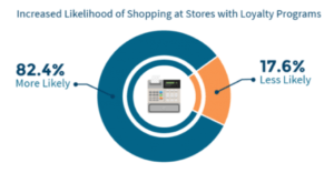
This encourages customer loyalty and increases the chances that more people will buy from your eCommerce store.
Drip Marketing
Some shoppers are not ready to buy something on the first click.
That’s something that you just need to accept. So make sure you have secondary CTAs with a drip marketing campaign set up.
For example, while someone may not be willing to buy, they may join your email list.
Now you can start a drip campaign by sending them a welcome message. This will be the first of several messages the subscriber will receive in the coming weeks. These campaigns will give them an incentive to come back to your site and eventually convert.
Automated Reorder Notifications
Let’s say you sell something like perfume.
If you sell 3.4 ounces to the customer, that should last for roughly three months.
Don’t just assume the customer will buy again when the perfume runs out. Do something to increase those chances.
Send them an email on day 85 after they completed the purchase reminding them to reorder the perfume. You can even offer a discount as well. This strategy does wonders for your conversions.
Autoship
We recently wrote a guide about autoship and recurring software functions.
If you sell any products on your eCommerce site that can be autoshipped with recurring orders, I would recommend reviewing that guide in greater detail to help you drive more sales.
SEO (Search Engine Optimization)
In order for website visitors to convert, you need to make sure they land on your page.
That’s why SEO is a key component for conversions. Your eCommerce platform MUST be visible.
Targeted inbound traffic will always convert better. That’s because those consumers are looking for something specific. If your shop is properly optimized for search engines, you’ll be able to fill the needs of the consumers.
Mobile
Your desktop website might be great, but you can’t forget about mobile users.
62% of mobile users have made an online purchase from their smartphones within the last six months.
By the end of 2018, mobile commerce sales will control roughly 40% of the retail eCommerce market in the United States. This number will reach nearly 54% by 2021.
Your eCommerce site needs to be optimized for mobile devices and needs to load fast.
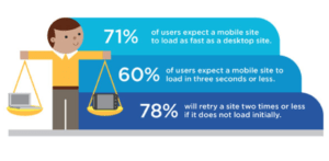
Longer load times will result in higher bounce rates, which will obviously impact your conversions in a negative way.
Conversions on your mobile site should be the same as your desktop site.
Conclusion
Your eCommerce store can’t afford to ignore CRO. eCommerce platforms such as Shopify, Volusion, Bigcommerce, VTEX, Oracle ATG and SAP Hybris all have specific apps and set ups that allow CRO. They just need to be customized a bit.
Lots of money can be made by making small adjustments to your website in an effort to drive conversions.
It all starts with understanding the conversion funnel and knowing your metrics. Figure out where you’re losing your customers.
Focus on your design and website authority. Show everyone that you’re a trustworthy brand.
Your product pages and shopping cart need to be user-friendly. Add certain functionality elements that drive conversions.
When in doubt, you can always use this guide as a reference for conversion rate optimization or contact us if you need further assistance.


