DIGITAL MARKETING
Looking To Expand
Your Business Online?
How We Implemented Custom Functionalities to Nourish’s eCommerce Site


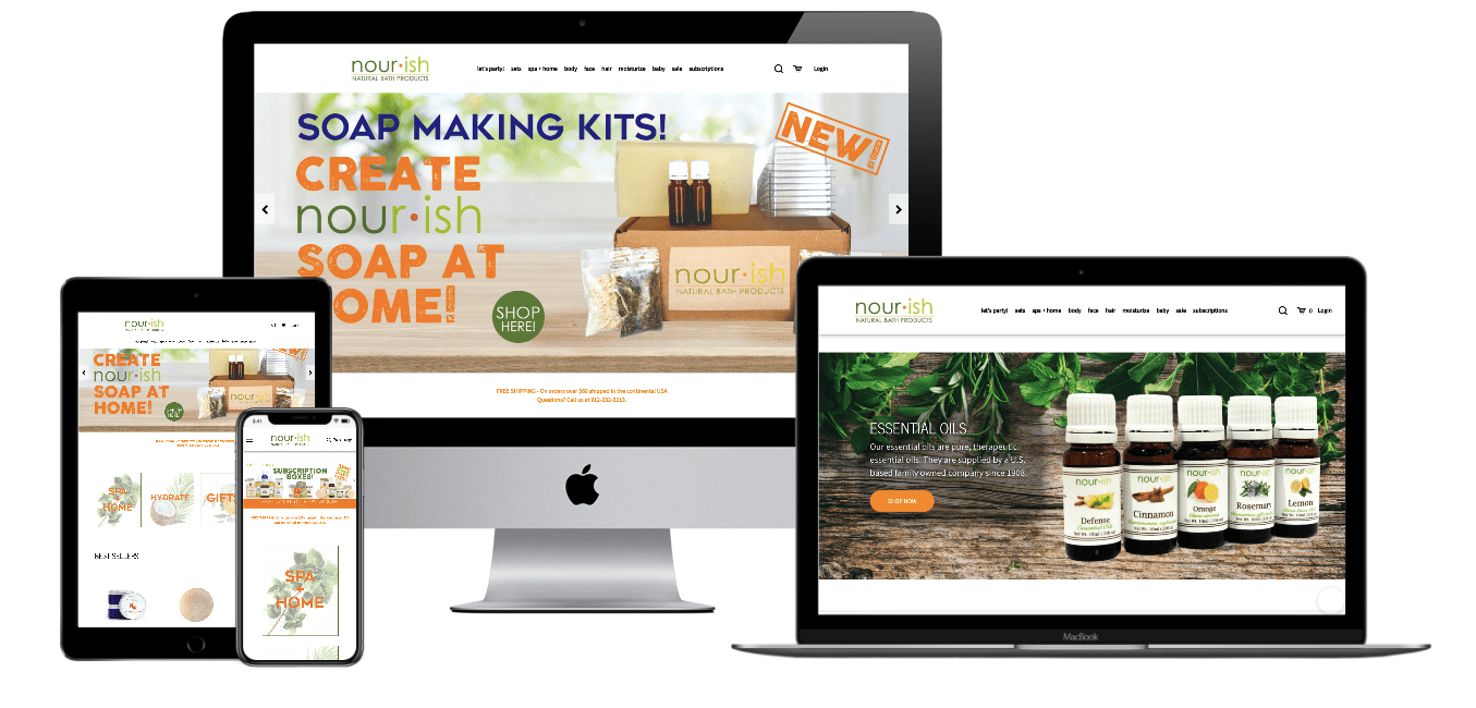
Nourish is a family business. The company makes natural soaps with completely harmless ingredients. Over time, Nourish went from a home kitchen to a retail store. Now, they provide customers with quality service at their new downtown Melbourne shop in Victoria, Australia. Nourish has expanded its product range by diversifying its products with various essential oils and natural ingredients based on customer needs.
Due to the checkout process on their website proving unsatisfactory, Nourish came to us in October 2019. They wanted to improve the user experience and checkout optimization. In line with Nourish’s customers and orders, we decided to make it easier for customers to buy their products.

We have several objectives with Nourish. The first was to improve the checkout page and turn more visitors into customers. The second was to provide improved shipping methods and increase customer satisfaction considerably. The third was to target product sales and improve their business. When the user experience becomes better, sales increase directly.
Ship to Multiple Addresses
Checkout Page Improvements
Guest Checkout Box
Cart Upsell Pop-up
This custom functionality allows customers to select multiple shipping addresses. These need to be fewer than the maximum number of addresses that can be entered into the customers’ accounts. We successfully implemented this feature into the shipping step of checkout. This helped Nourish to reach more natural product lovers out.


We have made improvements on the checkout page to streamline the checkout process and provide customers with an easy online shopping experience. We focused on trust elements and design changes made on the frontend.
The guest checkout reduces the time needed to complete online purchases. Forcing visitors to register often disrupts the purchase process. We have increased conversion rates by avoiding mandatory sign-ups and offering a guest checkout instead.


This feature boosts sales. It shows the products that the customers might be interested in, related to their choices. This increases their likelihood of buying more.
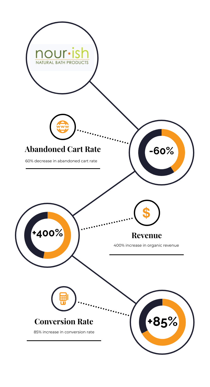
Results

Nourish is a family business. The company makes natural soaps with completely harmless ingredients. Over time, Nourish went from a home kitchen to a retail store. Now, they provide customers with quality service at their new downtown Melbourne shop in Victoria, Australia. Nourish has expanded its product range by diversifying its products with various essential oils and natural ingredients based on customer needs. Due to the checkout process on their website proving unsatisfactory, Nourish came to us in October 2019. They wanted to improve the user experience and checkout optimization. In line with Nourish’s customers and orders, we decided to make it easier for customers to buy their products.The Business

We have several objectives with Nourish. The first was to improve the checkout page and turn more visitors into customers. The second was to provide improved shipping methods and increase customer satisfaction considerably. The third was to target product sales and improve their business. When the user experience becomes better, sales increase directly.The Objective
Ship to Multiple Addresses Checkout Page Improvements Guest Checkout Box Cart Upsell Pop-up This custom functionality allows customers to select multiple shipping addresses. These need to be fewer than the maximum number of addresses that can be entered into the customers’ accounts. We successfully implemented this feature into the shipping step of checkout. This helped Nourish to reach more natural product lovers out. We have made improvements on the checkout page to streamline the checkout process and provide customers with an easy online shopping experience. We focused on trust elements and design changes made on the frontend. The guest checkout reduces the time needed to complete online purchases. Forcing visitors to register often disrupts the purchase process. We have increased conversion rates by avoiding mandatory sign-ups and offering a guest checkout instead. This feature boosts sales. It shows the products that the customers might be interested in, related to their choices. This increases their likelihood of buying more. The Strategy
Ship to Multiple Addresses

Checkout Page Improvements
Guest Checkout Box

Cart Upsell Pop-up
Results

Looking To Expand
Your Business Online?