What was the last post on Facebook that really caught your attention as you scrolled down a busy newsfeed? If you can remember the post, then you probably know what about it got your attention. Maybe it mentioned something that you cared about. Or perhaps it was the ad graphic that caught your eye. Whatever it was, it was probably something you cared about or could identify with.
Facebook is a powerful medium to advertise on because you can create ads and target them to the audience that they’re most likely to resonate with. You have to keep this in mind when preparing your text and graphics for an ad.
Advertisement Types
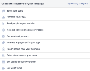
There are two primary types of posts that advertisers will use on Facebook and you’ve probably heard of them: the ad and the boosted post. There are several other types of ads, but they’re for more niche uses. We’ll be focusing on boosted posts and the two most standard ad types.

The Boosted Post is essentially a regular status update that you post on your wall and then turn into an ad. It will always show up on your timeline like any post you create. It will also show up on the newsfeed of the audience that you have targeted, even if those users don’t follow your page.
The advantage of a boosted post is that it looks very natural and organic to the user that it is displayed to. It appears as a post on their newsfeed and the only way to tell that it’s an ad is by the small (Sponsored) message shown the profile photo.
Since a boosted post blends in very well on most newsfeeds, an audience may be more likely to engage with it. Online users are naturally averse to ads, so the less yours looks like an ad, the better.
Pros: Look more “organic”, longer character limits.
Cons: Appear on your timeline and for your targeted audience, no call-to-action button.
The two most common types of Facebook ads are Send People to Your Website and Increase Conversions on Your Website. Sending people to your website is more effective for generating simple traffic. Increasing conversions is better for targeting those most likely to take a desired action such as making a purchase or submitting a form.
Unlike a boosted post, these types of Facebook ads do not appear on your own Facebook page; they only appear to the target audience you target in the ad set.
Facebook ads also feature an optional call-to-action button in the bottom right corner of the ad that can encourage users to take the desired action.
Pros: Easier to create and split-test, have a call-to-action button.
Cons: Shorter character limits, look more like ads.
Ad Copy
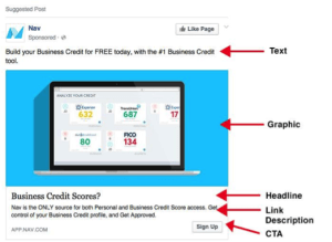
Your ad copy is extremely important and should never be an afterthought. It can make or break your ad’s performance. Facebook boost posts and ads are broken down into three main sections: text, headline, and link description.

- Text: Keep your primary ad text no longer than 2 or 3 lines long, with the inclusion of a link. No one wants to read an essay on their newsfeed. Write short, powerful messages that tout the benefits of your product or service and include a call-to-action. A common beginner mistake is writing too much. If you’re going to include a visible link, make sure the URL is clean and descriptive of where it’s leading to.
Bad URL: yourwebsite.com/alpha/lp/bs-3
Good URL: yourwebsite.com/offers/download-marketing-guide
- Headline: Your headline should be a bold statement about your product or service. It should be no longer than a few words on one line.
- Link Description: The link description provides additional information, but it’s not mandatory to use. You can provide trust-building statistics or strong points about your product or service here. As mentioned earlier, having a link description longer than one or two lines can make your ad seem bloated.

Ad Graphics
There are generally three types of graphics that people use in ads and boosted posts. When creating or finding your graphic:
- Follow basic design principles.
- Try to keep brand colors in the mix and the overall design clean, simple and modern.
- Be wary of white or light background images as they may not stand out as much on computer screens.
The 3 main types of image graphics are:
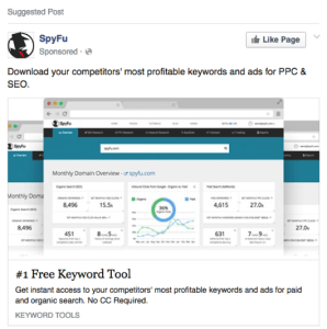
- Image: A graphic that is simply relevant to whatever the ad is talking about and enticing the target audience.
- Graphic: Generally just a simple image overlaid with text and visual elements related to what the ad is promoting.
- Hybrid Graphic: Usually includes an image with graphical elements such as additional text or a call-to-action button.
The best practice is to test a combination of these image types with the same audience to see what gets the most responses.
Targeting
If you have a great ad or post with a powerful message and a captivating image, but target the wrong audience, then users will just gaze over your ad.
Your ad relevancy score, positive feedback, and negative feedback are among the best metrics to look at in order to know whether your message is reaching the right audience. You’ll probably have to enable these columns in your ad manager. Ideally, you’ll want a high relevancy score, which means users are responding well to your ad. Your positive feedback should be medium or high and your negative feedback score should be medium or low.
If your positive feedback score is low and your negative feedback score is medium or high, it means that people are complaining to Facebook about your ad. Nothing bad will happen, but your ad will probably be shown less than other ads—and you’re probably wasting money on the wrong audience.
You should aim to have a positive feedback score that is higher or equivalent to your negative feedback score. Your ad relevancy score is an average of these two metrics. Aim to have an ad relevancy score of at least 4 or higher. Any less and you’re probably sending your message to the wrong audience.
Conclusion
Competitiveness on Facebook is extremely high because many advertisers understand its efficacy. You can make your ads stand out by following the simple tips above. Just make sure to keep in mind that you could have an outstanding ad, but if it’s being shown to the wrong people, then it’s not going to work well. Happy advertising!


